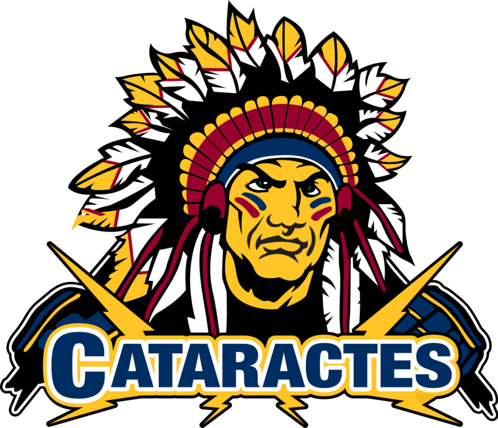
Shawinigan Cataractes Logo Color Codes HEX, RGB, CMYK, HSL & HSV
Shawinigan Cataractes Logo have 5 colors in their flag which are YELLOW(#FFC425), BLACK(#000000), WHITE(#FFFFFF), RED(#98002E) and BLUE(#002D62).
The Hex, RGB, CMYK, HSV, and HSL color codes are in the table below.
The name “Shawinigan Cataractes” has a rich meaning, drawing inspiration from both the team’s location and a powerful natural phenomenon:
1. Connection to Shawinigan:
- Cataractes is the plural form of cataracte, which in English means cataract in the sense of a powerful waterfall.
- This directly references the Shawinigan Falls, a prominent natural waterfall located in the city of Shawinigan, where the team plays.
- Choosing this name signifies a strong connection to the city’s identity and its most notable landmark.
2. Symbolism:
- Waterfalls are often associated with power, force, and dynamism. These qualities are desirable attributes for a hockey team, suggesting strength, resilience, and the ability to overcome obstacles.
- The image of a rushing waterfall can also evoke a sense of speed and excitement, further aligning with the fast-paced and exhilarating nature of the sport.
3. Historical context:
- The team was originally named the Shawinigan Bruins before adopting the Cataractes moniker in 1978.
- The name change likely reflected a desire to create a more unique identity for the team and establish a stronger connection to their local identity.
Overall, the name “Shawinigan Cataractes” serves as a powerful and evocative symbol, drawing inspiration from the city’s natural wonder and representing the team’s ambition and fighting spirit.
I hope this helps! Feel free to ask if you have any further questions about the Shawinigan Cataractes or anything else.
