Manchester City FC colors Color Codes HEX, RGB, CMYK, HSL & HSV
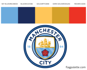
Manchester City FC colors have 5 colors in their flag which are SKY BLUE(#6CABDD), BLUE(#1C2C5B), GOLD(#FFC659), DARK GOLD(#D4A12A) and RED(#EC3325).
The Hex, RGB, CMYK, HSV, and HSL color codes are in the table below.
Man City Colors
Manchester City Football Club, one of the most prestigious football teams in the world, has a logo that reflects its rich history and modern aspirations. The club’s colors—sky blue, white, and navy blue—are integral to its identity, symbolizing its heritage, ethos, and connection with the fans. This article delves into the significance of these colors, the design elements of the logo, and the evolution of the club’s branding.
Colors and Their Meaning
Sky Blue: Sky blue is synonymous with Manchester City FC and symbolizes tranquility, confidence, and excellence. It represents the club’s aspiration to reach new heights and their calm yet determined approach to the game. The color also signifies the club’s connection to its roots and its community.
White: White stands for purity, simplicity, and integrity. It adds a clean and balanced contrast to the logo, emphasizing the club’s values of fairness and sportsmanship. White also provides clarity and highlights key elements of the design.
Navy Blue: Navy blue represents tradition, stability, and depth. It adds a layer of sophistication and authority to the logo, reflecting the club’s long-standing history and its established presence in the football world.
The Logo Design
The Manchester City FC logo is a blend of traditional and contemporary elements, capturing the club’s rich heritage and its forward-looking vision. The primary components of the logo include:
Circular Shape: The roundel shape of the logo signifies unity, wholeness, and community. It represents the club’s inclusivity and its bond with the fans.
Ship Symbol: At the top of the logo is a stylized ship, which represents the Manchester Ship Canal, highlighting the city’s industrial heritage and its historical significance as a major port.
Red Rose of Lancashire: Located at the bottom of the shield, the red rose symbolizes the club’s regional pride and its connection to the broader history of Lancashire.
Shield and Stripe Pattern: The central shield features three diagonal stripes, which are reminiscent of the club’s early kits. This element pays homage to the club’s history and its journey through the years.
Founding Year (1894): The inclusion of the year 1894, when the club was officially established, underscores the long-standing legacy and tradition of Manchester City FC.
Logo Versions Over the Years
The Manchester City FC logo has undergone several transformations, each marking a different era in the club’s storied history:
Early Years (1894-1972): The initial logos featured a simple design, often incorporating the club’s initials or basic symbols related to Manchester.
1972-1997: The logo during this period introduced the iconic circular design with the ship and red rose, emphasizing the club’s connection to Manchester and Lancashire. This version also included an eagle, representing strength and resilience.
1997-2016: This era saw a more modernized logo with a shield and an eagle. The design was more intricate, reflecting a contemporary aesthetic while maintaining traditional elements.
2016-Present: The current logo, introduced in 2016, brought back the circular design with the ship, red rose, and founding year. This version aimed to create a timeless and classic look, paying tribute to the club’s heritage while embracing a clean and modern design.