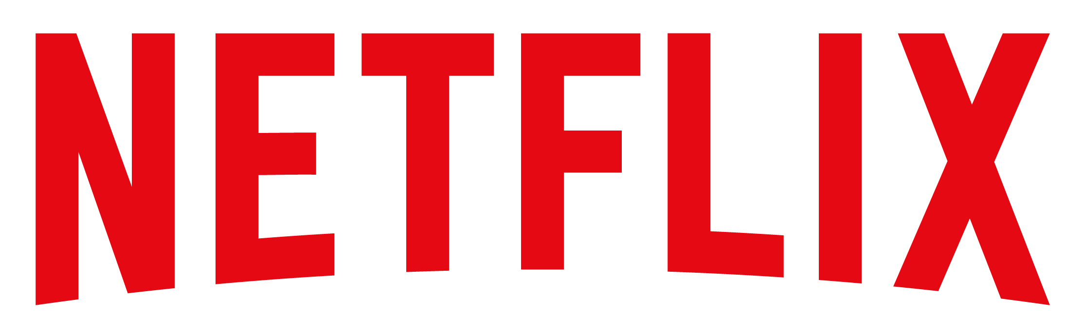
Netflix Logo Color Codes HEX, RGB, CMYK, HSL & HSV
Netflix Logo have 2 colors in their flag which are Red(#E50914) and Dark Red(#B20710).
The Hex, RGB, CMYK, HSV, and HSL color codes are in the table below.
In the ever-evolving landscape of digital entertainment, one brand has risen to become synonymous with streaming: Netflix. At the heart of this media giant’s visual identity lies its striking red logo. This article delves deep into the history, significance, and impact of Netflix’s logo color, exploring how this bold choice has helped shape one of the most recognizable brands in modern entertainment.
The Evolution of Netflix’s Logo
To fully appreciate Netflix’s iconic red, we must first trace the evolution of its logo:
1. 1997-2000: The Founding Era
Netflix’s original logo featured a purple-tinted film reel with white text, reflecting its initial business model of DVD rentals by mail.
2. 2000-2014: The Transition
As Netflix moved towards streaming, its logo evolved to a red text-based design with black shading, introducing the now-famous red color.
3. 2014-Present: The Streaming Giant
In 2014, Netflix unveiled its current logo: a simple, bold red text against a white background, sometimes accompanied by a stylized ‘N’ icon.
The Netflix Red
Netflix’s signature red is more than just a color; it’s a brand statement. The specific shade is:
– Hex: #E50914
– RGB: 229, 9, 20
– CMYK: 0, 96, 91, 10
This particular red is a vibrant, attention-grabbing hue that sits between true red and crimson, with a slight orange undertone that adds warmth and energy.
The Psychology Behind the Red
Netflix’s choice of red is far from arbitrary. This color carries powerful psychological associations that align closely with the brand’s identity and goals:
1. Excitement and Energy
Red is known to increase heart rate and create a sense of excitement, mirroring the thrill of discovering new content.
2. Passion and Emotion
As a color associated with strong emotions, red reflects the passionate storytelling Netflix aims to deliver.
3. Boldness and Confidence
The use of such a bold red signifies Netflix’s confident position as a leader in the streaming industry.
4. Urgency and Importance
Red can create a sense of urgency, potentially encouraging viewers to engage with content immediately.
5. Warmth and Comfort
The slightly warm undertone in Netflix’s red can evoke feelings of comfort, ideal for a service often enjoyed at home.
Brand Identity and Values
Netflix’s red logo plays a crucial role in communicating the company’s core values and brand identity:
1. Innovation
The bold, simple design reflects Netflix’s innovative approach to content delivery and creation.
2. Accessibility
The high-contrast, easily recognizable red ensures the logo is visible and memorable across various platforms and devices.
3. Global Appeal
Red is a color with positive associations in many cultures, helping Netflix maintain a consistent brand image worldwide.
4. Quality and Premium Experience
The rich, saturated red conveys a sense of quality and premium service, setting Netflix apart in a crowded market.
Practical Applications of the Logo Color
Netflix’s red extends far beyond just the logo, playing a crucial role in various aspects of the brand’s visual identity:
1. User Interface
The red accent color is strategically used throughout Netflix’s interface to guide user attention and create a cohesive experience.
2. Marketing Materials
From billboards to digital ads, Netflix’s marketing consistently leverages the iconic red to maintain brand recognition.
3. Original Content Branding
Netflix often incorporates its red into the opening sequences and promotional materials for its original content.
4. Physical Media and Merchandise
When Netflix does produce physical media or merchandise, the red logo prominently features, creating instantly recognizable products.
Cultural Impact and Global Recognition
Over the years, Netflix’s red logo has achieved a level of recognition that extends beyond mere brand identification:
1. “Netflix Red” as a Cultural Reference
The specific shade of red has entered the cultural lexicon, often referred to as “Netflix Red” even in contexts unrelated to the brand.
2. Meme Culture
The Netflix logo and its color have become common elements in internet memes, particularly those related to binge-watching culture.
3. Industry Influence
Netflix’s success has influenced other streaming services, with many adopting bold, single-color logos in an attempt to achieve similar brand recognition.
4. Architectural Integration
Netflix has incorporated its red branding into the design of its office spaces, creating immersive environments that reinforce the brand identity.
Challenges and Considerations
While Netflix’s red logo has served the company well, it also presents some challenges:
1. Color Reproduction
Ensuring consistent reproduction of the specific red across various media and devices can be technically challenging.
2. Cultural Sensitivity
While red is generally positive in many cultures, its connotations can vary, requiring careful consideration in global marketing.
3. Accessibility Concerns
The high contrast of red on white, while visually striking, needs to be balanced with accessibility considerations for users with visual impairments.
4. Evolving Brand Identity
As Netflix expands its services (e.g., into gaming), it may need to consider how its strongly entertainment-associated red fits with new offerings.
Future Prospects
Looking ahead, Netflix’s red logo is likely to continue playing a crucial role in the company’s brand identity:
1. Virtual and Augmented Reality
As Netflix explores new technologies, its distinctive red could be key in creating recognizable VR/AR experiences.
2. Personalization vs. Brand Consistency
Netflix may need to balance its iconic red with increasing demands for personalized user experiences.
3. Sustainability Messaging
As environmental concerns grow, Netflix might consider how its bold red aligns with messaging around sustainable streaming practices.
4. Evolving Content Strategies
If Netflix further diversifies its content (e.g., more interactive shows or user-generated content), it may need to consider how its current branding adapts to these new formats.
The Impact on Streaming Culture
Netflix’s red logo has had a significant impact on streaming culture:
1. Setting the Standard
The bold, simple design has influenced how other streaming services approach their branding.
2. “Netflix and Chill”
The phrase “Netflix and chill” has entered popular culture, with the red logo often serving as a visual shorthand for the concept.
3. Binge-Watching Aesthetics
The red color has become associated with the idea of binge-watching, influencing how people think about and discuss their viewing habits.
4. Content Discovery
The strategic use of red in Netflix’s interface has influenced how users interact with and discover content on streaming platforms.
Conclusion
Netflix’s red logo is far more than just a visual identifier – it’s a key component of one of the most successful digital entertainment brands in history. By consistently and creatively leveraging this bold color choice, Netflix has created a visual identity that’s instantly recognizable, emotionally resonant, and globally significant.
The story of Netflix’s red is a testament to the power of color in branding. It demonstrates how a well-chosen color, combined with strategic application, can become not just a visual cue, but a shorthand for an entire entertainment experience and cultural phenomenon. As Netflix continues to evolve and expand its streaming empire, its iconic red is sure to remain a beacon for viewers seeking their next binge-worthy obsession.
In the end, Netflix’s red logo embodies the excitement, passion, and innovation that have made the company a leader in the streaming revolution. It’s a prime example of how thoughtful color selection in branding can create an icon that not only stands the test of time but also shapes the very culture it serves.
Netflix Brand Guidelines (Verified Source)
Netflix Website
Logo Source