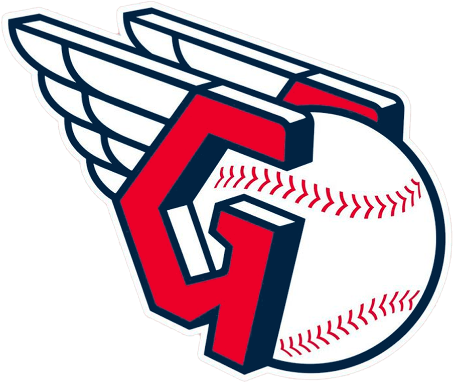
Cleveland Guardians Color Codes HEX, RGB, CMYK, HSL & HSV
Cleveland Guardians have 3 colors in their flag which are NAVY BLUE(#00385D), RED(#E50022) and WHITE(#FFFFFF).
The Hex, RGB, CMYK, HSV, and HSL color codes are in the table below.
The Cleveland Guardians Logo: Colors, Meaning, and Evolution
The Cleveland Guardians, formerly known as the Cleveland Indians, have a storied history in Major League Baseball (MLB). The team’s logo and colors—navy blue, red, and white—are integral to their identity, reflecting their heritage and commitment to the sport. This article explores the significance of these colors, the design elements of the logo, and the evolution of the team’s branding.
Colors and Their Meaning
Navy Blue: Navy blue symbolizes tradition, strength, and reliability. It is a color that conveys a sense of trust and depth, aligning with the Guardians’ long-standing presence in the MLB and their solid fan base.
Red: Red represents passion, energy, and action. It signifies the fervor and enthusiasm of the players and fans alike. The inclusion of red in the logo highlights the team’s dynamic spirit and competitive nature.
White: White stands for purity, simplicity, and integrity. It acts as a balancing color, providing clarity and contrast. In the Guardians’ logo, white underscores the team’s commitment to fairness and sportsmanship.
The Logo Design
The Cleveland Guardians’ logo is a modern emblem that integrates traditional elements with contemporary design, symbolizing the team’s rich heritage and forward-looking vision:
The “G” with Wings: The primary logo features a bold letter “G” adorned with stylized wings. This design pays homage to the iconic “Guardians of Traffic” statues that grace the Hope Memorial Bridge in Cleveland. The wings signify protection, speed, and guardianship, embodying the spirit of the team.
Color Integration: The logo effectively uses navy blue, red, and white to create a visually appealing and meaningful design. Navy blue forms the base, providing a solid foundation, while red adds vibrant accents. White is used to highlight and define the details, ensuring the logo is clear and impactful.
Logo Versions Over the Years
The Cleveland baseball team has undergone several logo changes throughout its history, reflecting different eras and brand identities:
Early Years (1915-1945): The team’s early logos often featured a stylized “C” or variations of Native American imagery, aligning with the “Indians” moniker.
Chief Wahoo (1946-2018): Perhaps the most controversial and well-known logo, Chief Wahoo, was a caricatured Native American figure. While it became an iconic symbol for many fans, it also faced significant criticism for its racial insensitivity.
Block “C” (2014-2021): As the team moved towards a more neutral and less controversial symbol, the block “C” logo was introduced. This simple and clean design marked a shift towards modernity and inclusivity.
Cleveland Guardians (2022-Present): The transition to the Cleveland Guardians brought a complete rebranding. The new logo, featuring the “G” with wings, connects the team’s identity to a beloved local landmark while embracing a fresh and forward-thinking image.
Download Cleveland Guardians Flag
Cleveland Guardians Flag Info
| Designed by | Cleveland Guardians |
| Mascot | Cleveland Guardians Mascot |
