Arizona Diamondbacks Color Codes HEX, RGB, CMYK, HSL & HSV
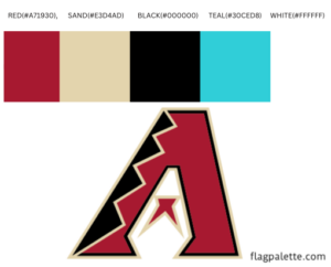
Arizona Diamondbacks have 5 colors in their flag which are RED(#A71930), SONORAN SAND(#E3D4AD), BLACK(#000000), TEAL(#30CED8) and WHITE(#FFFFFF).
The Hex, RGB, CMYK, HSV, and HSL color codes are in the table below.
The Evolution and Significance of the Arizona Diamondbacks Logo
The Arizona Diamondbacks, a Major League Baseball team established in 1998, have cultivated a distinctive identity through their evolving logos. Each iteration of the Diamondbacks’ logo has reflected the team’s growth, regional heritage, and dynamic spirit. The current logo, featuring colors such as Sedona Red, Sonoran Sand, black, teal, and white, encapsulates the essence of the team’s identity.
Colors and Their Meaning
Sedona Red: This rich, earthy tone is inspired by the iconic red rocks of Sedona, Arizona. It symbolizes the team’s deep connection to their home state and represents strength, passion, and determination.
Sonoran Sand: Reflecting the hues of the Sonoran Desert, this color conveys a sense of place and heritage. It highlights the Diamondbacks’ roots in Arizona and their pride in the unique landscape of the region.
Black: Black adds a bold, modern contrast to the logo. It symbolizes power, sophistication, and resilience, traits that the Diamondbacks strive to embody both on and off the field.
Teal: Teal provides a vibrant, fresh accent, representing creativity, energy, and the forward-thinking nature of the team. It adds a unique touch to the color palette, distinguishing the Diamondbacks from other MLB teams.
White: White serves as a balancing color, symbolizing purity, simplicity, and clarity. It helps to highlight and contrast the other colors, ensuring the logo is visually striking.
The Logo Design
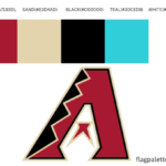
The Arizona Diamondbacks’ logo is a masterful blend of modern aesthetics and regional symbolism. The primary logo features a stylized “A” that incorporates design elements inspired by the team’s desert surroundings and cultural heritage:
Stylized “A”: The central element of the logo is the letter “A,” designed to resemble a snake, with a diamond pattern running through it. This design pays homage to the Western Diamondback rattlesnake, a native species of the Arizona desert. The snake motif conveys agility, stealth, and precision, qualities that the Diamondbacks aim to exhibit in their gameplay.
Color Integration: The use of Sedona Red and black in the “A” creates a bold, eye-catching contrast, while the addition of Sonoran Sand and teal accents adds depth and regional flavor. The white outlines ensure the logo remains crisp and clear.
Logo Versions Over the Years
Since their inception, the Arizona Diamondbacks have had several logo versions, each reflecting different aspects of their identity and evolution as a team:
1998-2006: The original logo featured a more complex design with a purple and teal color scheme, showcasing a large “A” with a snake-like appearance. This logo established the team’s initial identity and their connection to the Arizona desert.
2007-2011: The Diamondbacks introduced a new logo with a simplified and modernized design. The “A” became more angular and stylized, with Sedona Red, black, and Sonoran Sand as the primary colors. This version marked a significant shift towards a more cohesive and regionally inspired brand identity.
2012-Present: The current logo retains the stylized “A” with further refinements. The addition of teal accents adds a fresh, vibrant touch, while the overall design remains true to the team’s heritage and connection to the Arizona landscape. This logo reflects the Diamondbacks’ commitment to maintaining their unique identity while evolving with the times.